
Boots and Hearts Premium Visual System & Brand Guide
Explore the premium visual system for Boots and Hearts music festival. Learn about the design framework for high-value experiences like Daisy Duke's.
BOOTS AND HEARTS
PREMIUM
VISUAL
SYSTEM
A more polished visual tier within the Boots and Hearts brand — elevated, warm, and unmistakably festival.
01
OVERVIEW
WHAT WE ARE BUILDING
A premium visual treatment for Boots and Hearts higher-value experiences. Same brand — higher tier.
This keeps the brand familiar — existing fonts, colours, logo, and real festival imagery — but applies everything in a more polished way so premium products feel elevated at first glance.
THIS SYSTEM APPLIES TO:
Daisy Duke's
VIP
The Barn
After Parties
Premium Hospitality
Premium Food & Beverage
Access Perks
Future Premium Offerings
DAISY DUKE'S
THE ANCHOR PRODUCT
DAISY
DUKE'S
The First Example of the Premium Visual System
Daisy Duke's is the newest premium product and needs the clearest explanation. It is the anchor for this entire visual system.
THE KEY HIERARCHY:
Daisy Duke's is the premium hospitality product.
VIP is included with it — not the other way around.
The best seat in the house.
DAISY DUKE'S
THE CAROUSEL
FRAMEWORK
5 slides. Image-led. Social-first. Simple.
DAISY DUKE'S DECK
The Best Seat in the House
SLIDE 01
THE HOOK
Stop the scroll.
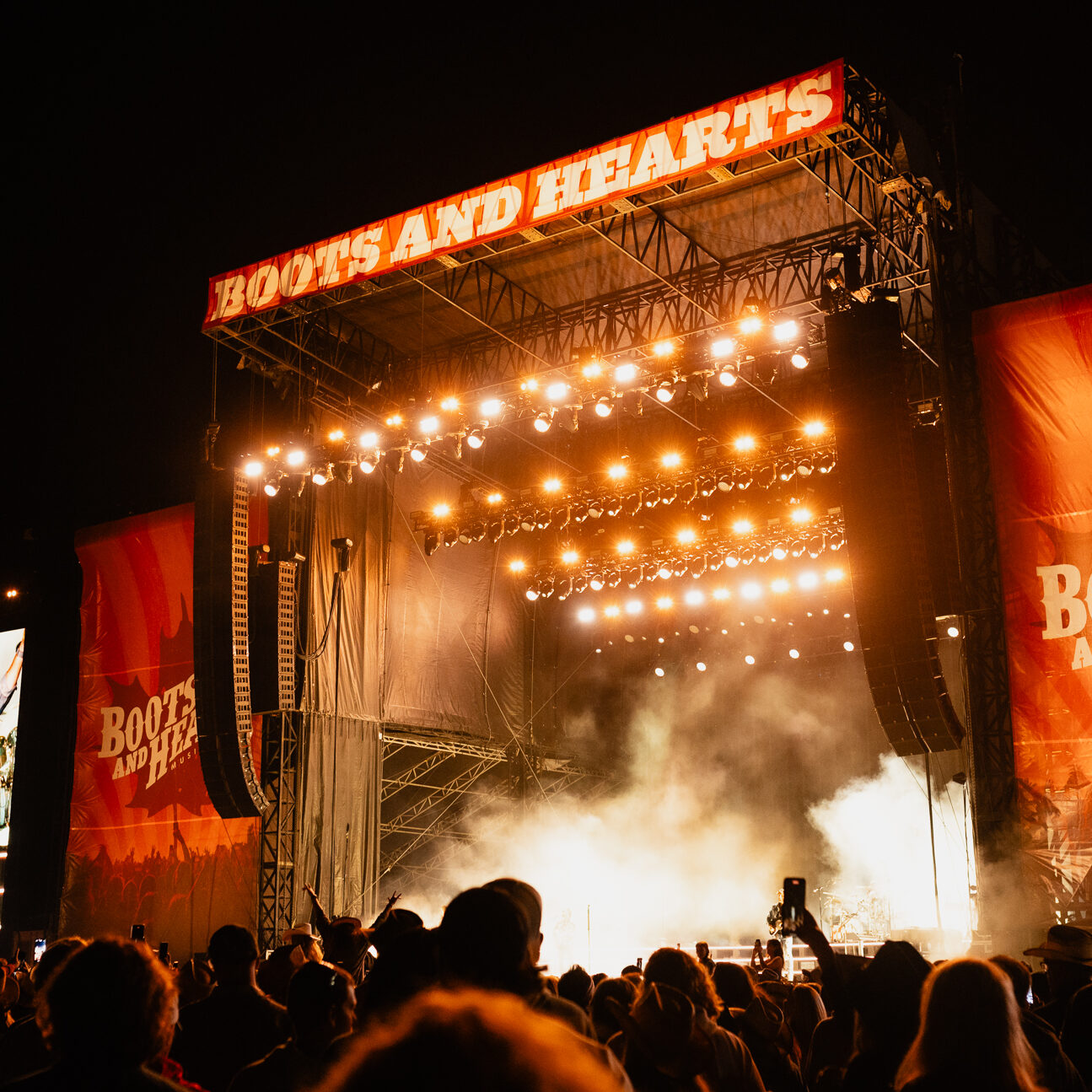
Make the product feel exciting. The first impression of Daisy Duke's.
Daisy Duke's Deck is the best seat in the house.
Small B&H logo. Sketch-style swipe cue in corner. Minimal copy.
SLIDE 02
WHAT IT IS
Explain the product simply.
PURPOSE:
Make it immediately clear what Daisy Duke's is and what it costs.
MESSAGE:
Daisy Duke's is a premium hospitality ticket — not regular VIP.
COPY DIRECTION:
Private table for 4
Elevated Main Stage view
$5,000 for 4 guests
VIP included all weekend
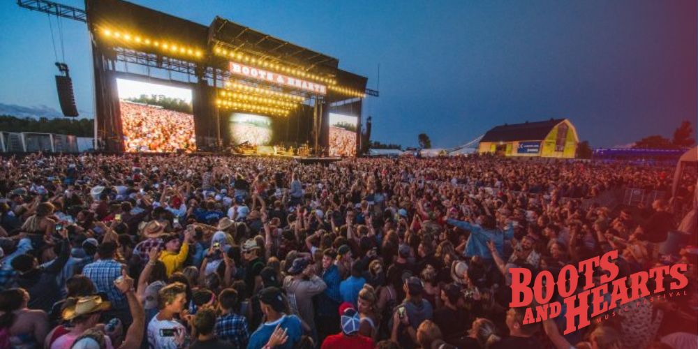
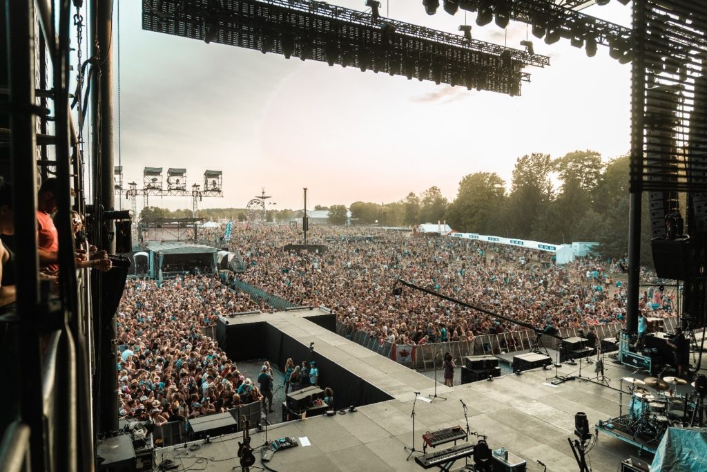
Image should reinforce the elevated, above-the-crowd feeling.
YOUR TABLE
ABOVE THE CROWD
ON THE DECK
SLIDE 04
VIP INCLUDED
Make the hierarchy clear.
Daisy Duke's gives you the deck access — plus everything in VIP. Not the other way around.
VIP is a bonus. Daisy Duke's is the product.
PLUS THE REST OF VIP
Front-of-stage viewing
Private VIP entrance
Daily after parties
Private comfort washrooms
Premium food and beverage options
The nighttime image reinforces the party energy — the bonus perks feel exciting.
A WEEKEND
WITH A VIEW
Limited tables available.
SLIDE 05
FINAL SELL
End with the feeling.
Leave them wanting to be there. Urgency meets emotion.
A weekend with the best view. Limited tables available.
A WEEKEND
WITH A VIEW
Limited tables available.
No swipe arrow on the final slide.
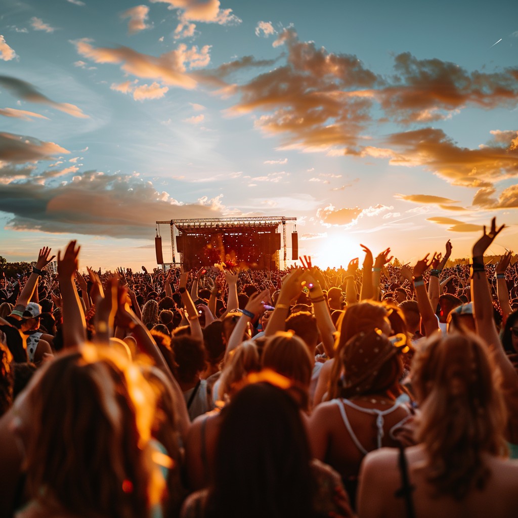
Dreamiest image. Most emotional. The colour grade should feel slightly different from the rest — richer, more golden, more purple sky.
STYLE GUIDE
PREMIUM STYLE
VISUAL ELEMENTS
The elements that carry across every premium Boots and Hearts asset.
01
STYLE ELEMENT
REAL IMAGERY
USE
Use real Boots and Hearts photography wherever possible.
The goal is to elevate what is real — not sell something that does not exist yet.
AVOID
Fake people, fake lounges, fake hospitality moments, fake VIP spaces. Do not create imagery that overpromises the experience.
Elevate what is real.
A premium visual approach relies on the authenticity of the festival atmosphere to build genuine connection.
02
STYLE ELEMENT
CONSISTENT PHOTO
TREATMENT
All premium assets should feel like they belong together visually.
THE GRADE:
Warm sunset tones
Soft cream highlights
Deep red accents
Hints of purple or blue in the sky
Slight film grain
Soft contrast and light texture
Goal: dreamy festival film — not dark luxury.
03
STYLE ELEMENT
TYPOGRAPHY
ZIGGURAT
MAIN HEADLINES
Primary display. All major headlines.
CHAMPION
SUPPORTING HEADLINES & CALLOUTS
Callouts, supporting headlines, feature copy.
BRANDON
Body copy only when needed.
Sparingly. Small supporting copy.
The premium feeling comes from spacing, scale, restraint, and layout — not from introducing new fonts.
STYLE ELEMENT
INTEGRATED TYPE TREATMENT
The copy should feel like it belongs inside the image — not like it was placed on top after.
TO ACHIEVE THIS:
Use cream or warm off-white — not harsh white
Add subtle grain over the full finished asset
Slightly soften contrast between type and photo
Avoid razor-sharp type over soft imagery
Keep type large and intentional
Fewer words per slide
The final graphic should feel flattened and cohesive — like one finished piece of artwork.
A WEEKEND
WITH A VIEW
INTEGRATED ✓
Type belongs inside the artwork.
STYLE ELEMENT
REFINED BOOTS PALETTE
USE
Stay within the Boots and Hearts world — but elevated.
AVOID
No black and gold. No neon. No generic luxury signifiers.
STYLE ELEMENT
IMAGE-LED LAYOUT
The image does most of the selling. Premium doesn't mean adding more design — it means stronger restraint.
USE
AVOID
Large visuals
One message per slide
More breathing room
Cleaner hierarchy
Fewer words
Intentional crops
Tiny copy
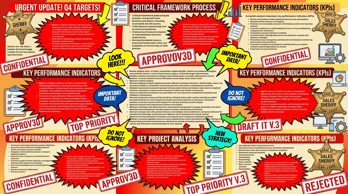
Too many boxes
Too many callouts
Badges and stamps
Over-designed western elements
Anything that feels like a Canva template
OVERALL DIRECTION
SAME BRAND.
HIGHER TIER.
Regular Boots and Hearts social keeps the big festival energy. Premium offerings get a more polished, elevated treatment that makes the product feel higher value before someone reads the details.
SHOULD FEEL:
SHOULD NOT FEEL:
Elevated
Polished
Warm
Feminine
Expensive
Fun
Social-first
Still Boots and Hearts
Corporate
Sales-heavy
Too dark
Too editorial
Too luxury-hotel
Too country-club
Like a Canva template
- brand-strategy
- visual-identity
- music-festival
- premium-branding
- design-guide
- marketing-framework